
How to visualize large data sets with Exasol
Have you ever wanted to explore ALL of your data by creating ad hoc visualizations and drilling down to the lowest level of granularity?
Perhaps you feel limited with the data available in Extracts or your team is tired of maintaining and building Extracts?
If so, you are in luck. Exasol with a live connection to Tableau Desktop or Server will do more than just solve these problems. In this step-by-step guide, we will show you how to connect Tableau Desktop to our Exasol Showcase cluster and visualize nearly a billion records in our healthcare prescriptions data set. We will drill down into the raw data and show you how to work with interactive dashboards to demonstrate how much you can achieve when you combine Exasol and Tableau.
Let’s get started…
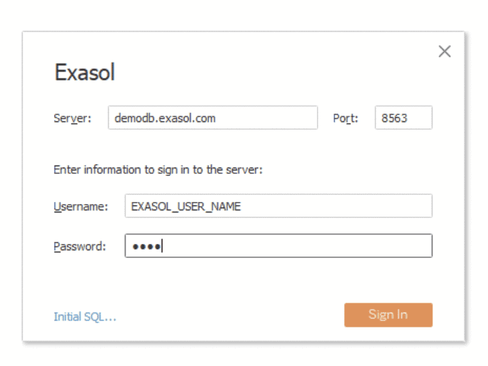
1 – Obtain access to you our Exasol PUBLIC DEMO system by registering for an account here: https://www.exasol.com/en/download/#exacloud
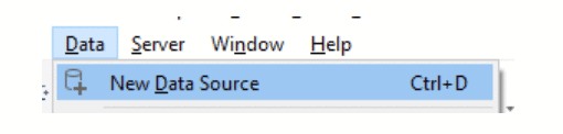
2 – Open Tableau Desktop
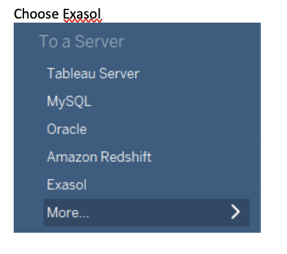
3 -Create a new Exasol Data Source
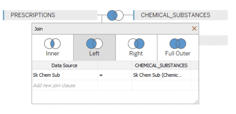
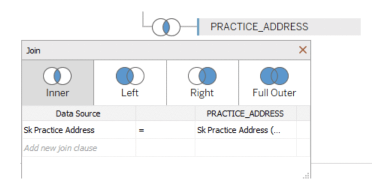
4 – Select the SCHEMA PRESCRIPTIONS_UK and add the TABLES:
- PRESCRIPTIONS
- CHEMICAL_SUBSTANCES
- PRACTICE_ADDRESS
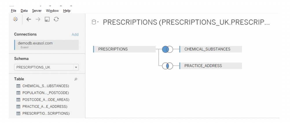 5 – Update the joins and join relationships
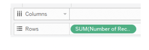
6 – Create tab 1: # of Records
7 – Create tab 2: Yearly Trend Over Time
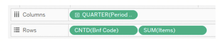
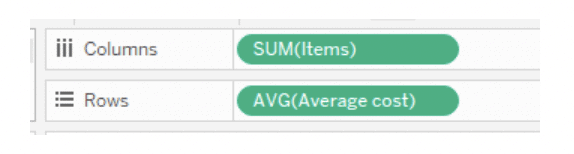
8 – Create tab 3: Subscription Costs/# of Items
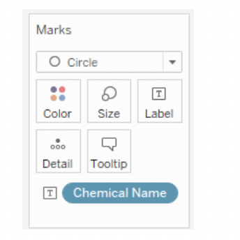
9 – Navigate to tab “Most prescribed medications in England”
10 – Drill down on map by clicking a region
11 – The sheet “What are the medication trends within this area?” will display
12 – And it’s done! Have fun exploring the data.
Feel free to try analyzing our other public data sets here. Just download the .tds files, enter your new public demo system credentials, and start analyzing.
If you want to see this guide brought to life, sign up for the webinar that will take you through the whole process, here